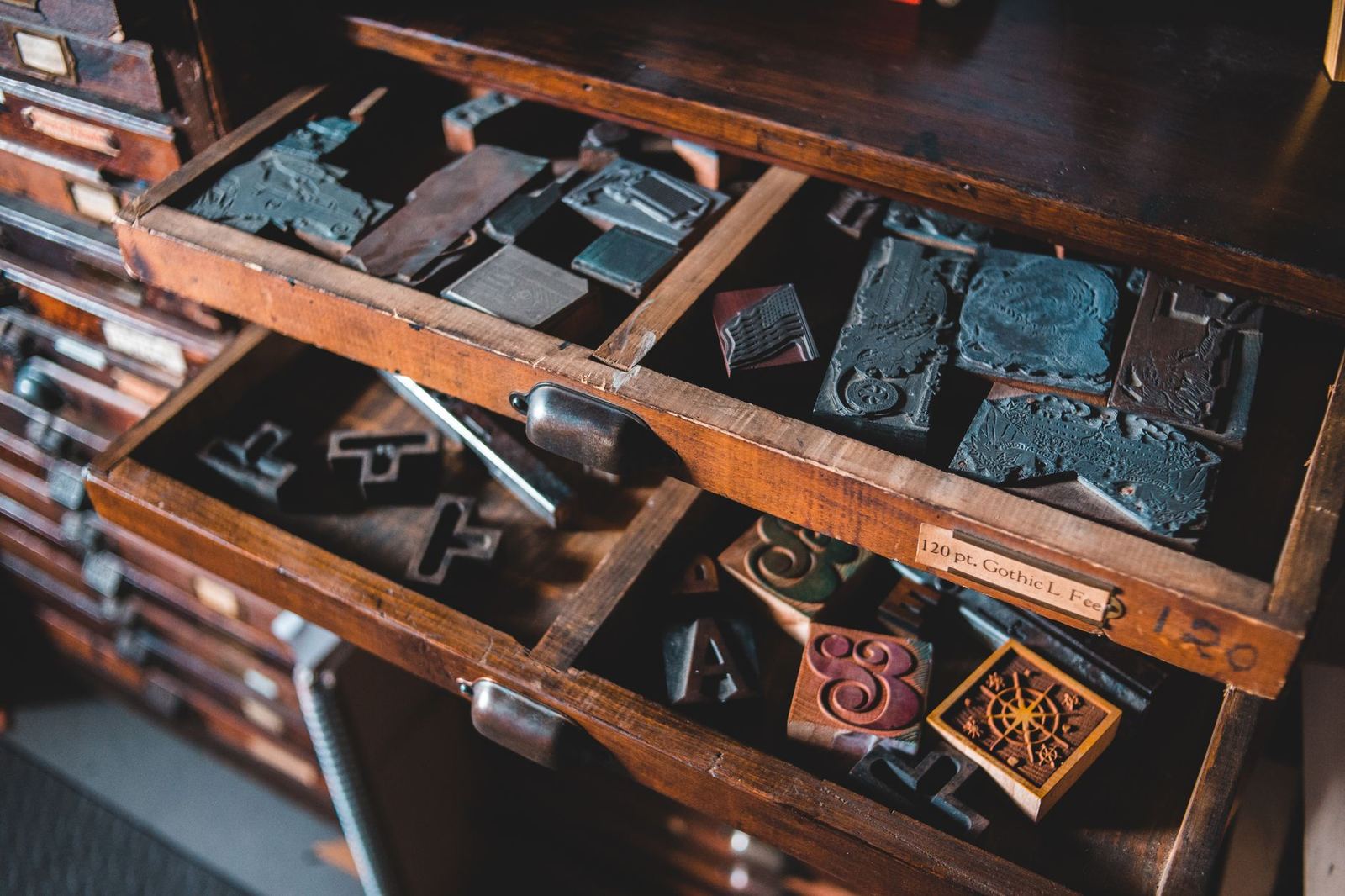
A logo font is the typeface used to set a name in a logo or wordmark. Choose it by how well its letterforms express the brand’s personality, stay legible at small sizes, and can be used legally in a logo.
Type choice for identity work builds on typography basics, but a logo asks more of a typeface than body text does, because the name is seen constantly and must be recognised at a glance.
Logo, logotype and wordmark: the terms
The vocabulary around logos overlaps. Wikipedia defines a logo as a graphic mark, emblem or symbol used to aid and promote public identification and recognition, which may be abstract or figurative or may include the text of the name it represents. A wordmark, according to the same source, is a text-only statement of the name of a product, service, company, organization or institution that is used for identification and branding.
That distinction decides how much work the typeface does. In a symbol-plus-name logo, the picture carries some of the recognition and the font plays a supporting role. In a wordmark, the letterforms are the logo, so every detail of the typeface, from the terminals to the proportions, becomes part of the brand.
The source also notes that a wordmark can be an actual word, a made-up term that reads like a word, or an acronym, initialism or series of letters. Each of these has different needs. A short acronym is mostly a shape and can tolerate a bold, geometric face. A longer name must stay readable while being compact, so a very decorative face may fail.
Matching the typeface to the brand
Letterforms carry associations before a single word is read. Serif faces tend to feel established, editorial or traditional. Sans serif faces tend to feel direct, modern or technical. Rounded forms feel friendly, while sharp angles feel precise or energetic. Script and display faces signal personality but need more care. The broader contrast between these families is covered in the guide to serif and sans serif fonts, and the same principles apply at logo scale.
A practical approach is to write down three or four adjectives describing the brand before looking at any typefaces, then test candidates against that list. A typeface that looks attractive in isolation but contradicts the brief is a poor match. Testing the name itself, not placeholder text, matters: letter combinations such as a tall ascender next to a round bowl can change the feel of a typeface entirely.
Weight, width and proportion
Weight is the quickest lever on tone. Heavy weights read as confident and are robust at small sizes. Light weights feel refined, but thin strokes can vanish when the logo is small or printed on a rough surface. Width works in a similar way: condensed faces fit narrow spaces and feel urgent, extended faces feel stable and spacious. Many families offer these as separate styles, and variable fonts expose them as a continuous range, so it is worth comparing several settings of the same family before moving on to a different design.
Legibility and flexibility
A logo has to work in many places: a favicon, an app icon, a printed label, a social media avatar and a large sign. A face that is elegant at a large size can collapse when reduced, with fine serifs filling in and counters closing up. The usual test is to reduce the wordmark to the smallest size it will realistically appear, in one colour, and check that each letter is still distinguishable.
It also helps to test the wordmark on both light and dark backgrounds, reversed out of colour, and in a single flat colour with no effects. A logo that depends on gradients, shadows or texture to be recognisable is fragile.
Context testing is where mockups become useful. Placing a wordmark on a product label, a shopfront sign or a letterhead shows how it behaves on real surfaces before any money is spent on production, and it exposes problems such as thin strokes that disappear on textured paper.
Kerning and customising the letters
Fonts are designed to set paragraphs, and their default spacing is tuned for running text. At logo size, uneven gaps are obvious. For that reason designers almost always adjust spacing by hand, as described in the guide to kerning tracking and leading. Wikipedia notes that poor kerning can, in the worst case, cause different words to be read than the ones intended, as set out in its kerning article. In a name that is the entire logo, that risk is not acceptable.
Many identity designers go further and modify the letters themselves: joining a pair, trimming a terminal, replacing one character with a custom shape. Customising a typeface in this way makes the result harder to confuse with other brands that use the same font. Whether and how a font may be modified depends on its licence, so that should be checked before any edits begin.
Once a wordmark is final, designers typically convert the text to outlines in vector artwork, so the logo no longer depends on the font being installed wherever it is opened. That makes the artwork portable, but it does not change the licensing obligations that came with the font.
Licensing a font for a logo
Typeface licensing is where logo projects most often go wrong, because a licence that covers setting text on a page does not always cover turning a font into a brand asset. Terms vary by foundry, and the general rule is to read the actual licence for the specific font and ask the rights holder when unsure. This is general information, not legal advice.
It helps to know how the main systems differ. The US Copyright Office circular on works not protected by copyright states that copyright law does not protect typeface or mere variations of typographical ornamentation or lettering in the United States. That does not mean a font file can be used however anyone likes: font software can be covered by a licence agreement, and other countries treat typeface designs differently. The distinction between a typeface design and the software that delivers it is why licence wording matters.
Some licences state their position on logos directly. The FAQ for the SIL Open Font License says that authors of fonts released under that licence allow their font software to be used for any kind of design work, with logos given as one example, and that no additional licence or permission is required, unlike with some other licences. Commercial font licences often draw the line differently, and some require a separate licence for logo use, so the answer for a given font has to come from its own terms. More detail on the licence types is in the guide to font licensing.
Trademark considerations
A logo is meant to identify the source of a business, and that purpose raises a separate question from copyright. The US Patent and Trademark Office explains that a trademark identifies the source of goods or services, and that creative and unique trademarks are more effective and easier to protect. A wordmark set in an unmodified common typeface is legally and visually weak compared with one that has distinctive features. This is a further reason to customise letterforms, and a reason to speak with a qualified professional before registering a mark.
Pairing a logo with other fonts
The logo typeface rarely has to carry the whole brand. Websites, packaging and documents also need text faces, and the choice should support the wordmark rather than compete with it. The principles in the guide to font pairing apply directly: contrast in structure or weight, a shared mood and a clear role for each face. A distinctive logo font often works best beside a quiet, highly readable text face.
Some identities use the logo typeface for headlines as well, which keeps the system tight, while others reserve it for the logo alone so the mark stays unique. Either approach can work as long as the rule is written down and applied consistently.
A simple selection process
- Write the brand adjectives and the contexts where the logo will appear.
- Shortlist a handful of typefaces whose licences allow logo use.
- Set the actual name in each and compare them at small and large sizes.
- Pick a winner, then adjust spacing and customise letters to make it distinct.
- Test in one colour, reversed out and on realistic mockup surfaces.
- Keep a record of the font, version and licence used for the final artwork.
Frequently asked questions
What is the difference between a logo and a wordmark?
A logo is any graphic mark used for identification, while a wordmark is a text-only logo made of the name itself. A logo may combine a symbol and text; a wordmark relies entirely on letterforms.
Can any font be used in a logo?
Not automatically. Each font comes with its own licence, and some cover logo use while others require a separate licence or exclude it. The licence for the specific font should be read, and the rights holder asked when the wording is unclear.
Should a logo font be customised?
Often, yes. Adjusting spacing and modifying a few letters makes the wordmark more distinctive and avoids looking like any other use of the same font, provided the licence permits modification.
Which type style suits a new brand?
It depends on the personality the brand needs to express. Serif styles often suggest tradition, sans serif styles suggest a modern or technical feel, and the best test is to set the real name in several candidates at small sizes.