
Typography basics cover how letters are chosen, sized, spaced and arranged so that text can be read comfortably and carries the right tone for the design it sits in.
This guide is the starting point for the typography topic on this independent information site, and each section points to a deeper article on one part of it.
Why typography shapes a design
Most interfaces, posters, packages and presentations are made largely of text. Before a visitor reads a single word, the shape of the letters, the amount of space around them and the contrast between headings and body copy have already signalled whether the page is serious or playful, dense or airy, trustworthy or careless. Typography is the discipline that controls those signals.
It helps to separate the jobs that type does at the same time. One is functional: the text must be seen, recognised and understood. The other is expressive: the letterforms carry personality and set expectations. A rounded, friendly face on a legal notice feels wrong for the same reason a stiff, formal face feels wrong on a children’s party invitation. Good typographic decisions satisfy both, and when these conflict, readability usually has to win.
Typography also does quiet structural work. Size, weight and spacing tell the reader what is a title, what is a caption and what is a warning, without any extra decoration. The idea is explored in depth in the article on typographic hierarchy, which looks at how to guide a reader through a page.
The same decisions matter when a design is presented to a client or a team. A mockup with placeholder text set in the wrong face or at the wrong size misrepresents the finished product, which is why typography belongs in any conversation about what is a design mockup and how it is used.
Typefaces, fonts and the parts of a letter
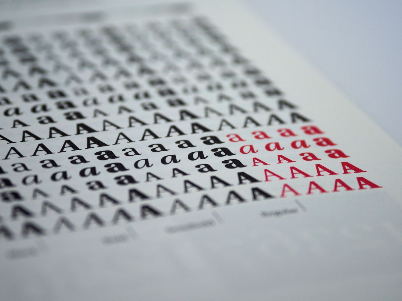
The words typeface and font are often used as if they meant the same thing. In traditional usage, a typeface is the design of a family of letters, such as a particular serif design, while a font is one specific style and size of it, such as the bold weight of that design. In everyday software, “font” has largely absorbed both meanings, and the difference only matters when reading licences or technical documentation.
A typeface family usually contains several weights (light, regular, bold) and styles (roman and italic), and some include different widths as well. Treating the family as a toolkit, rather than choosing a single style, is what lets a designer build contrast inside one design. Newer formats can pack a whole range of weights and widths into a single file, a topic covered in the article on variable fonts.
Several terms of anatomy recur in any discussion of type:
- Baseline: the invisible line on which most letters sit.
- x-height: the height of a lowercase letter such as x, measured from the baseline. Faces with a tall x-height tend to look larger at the same nominal size.
- Ascenders and descenders: the strokes that rise above the x-height (as in b or d) and drop below the baseline (as in p or g).
- Counters: the enclosed or partly enclosed spaces inside letters such as o, e and a.
- Serifs: the small finishing strokes at the ends of the main strokes in some designs.
These details explain why two faces set at the same point size can look so different. A face with a large x-height and open counters stays clear at small sizes, while a face with a small x-height and tight counters needs more size and spacing to reach the same comfort.
Serif, sans serif and other categories
The most familiar split is between serif and sans serif designs. Web standards define the generic families in plain terms: according to the MDN reference for the CSS font-family property, serif glyphs have finishing strokes, flared or tapering ends, or have actual serifed endings, and sans-serif glyphs have plain stroke endings. The same reference lists further generic families, including monospace, which gives every character the same width and is the usual choice for code.
Beyond these, designers talk about slab serifs, display faces, script faces and handwriting-style designs. Display and script designs are made to be used large and sparingly: they bring character to a headline or a logo, but they tire the reader if they carry a long paragraph. Body text is better served by a neutral, well-spaced serif or sans serif that does not call attention to itself.
Neither category is automatically better. Serifs are often associated with print and long reading, and sans serif designs with screens and interfaces, but both associations have many exceptions and depend heavily on the particular design and the rendering quality of the device. The comparison, with practical guidance for different media, is the subject of the article on serif vs sans serif.
Because the right choice depends on the job, it helps to ask some questions first. What is the text for: a headline, a paragraph, a button label, a table of numbers? Where will it be read: on a phone in sunlight, on a printed sheet, on a large screen at a distance? Who is reading, and how long will they stay? The answers narrow the field far faster than browsing through endless designs.
Choosing and combining typefaces
Many projects need more than one typeface, typically a design for headings and another for body text. Combining them well is a matter of contrast and shared qualities: the pair should be different enough that the roles are clear, yet similar enough in proportions and mood that they do not fight. The techniques, including how to build a pairing around a single family, are covered in the article on font pairing.
A few habits keep a type palette under control. Restrict the number of families, because every extra family adds noise and, on the web, extra data to load. Use weight, size and style within a family to create variety before reaching for a new one. Check candidate faces with the real content, since a design that looks elegant on a sample headline can fall apart on a long product name or a paragraph with numbers.
Typefaces chosen for a brand mark follow different rules from those chosen for reading. A wordmark is a small, fixed piece of text, so distinctiveness and the way letters fit together matter more than long-text comfort, and the letters are often adjusted by hand. The considerations are covered in the article on choosing a logo font.
Browsers and operating systems also supply fallbacks. Developers list several families in order of preference, and the MDN reference states that a generic font family should be the last item in the list of font family names. That final generic name guarantees that something reasonable appears if the preferred face is unavailable, so fallbacks are part of the typographic plan, not an afterthought.
Size, spacing and line length
Once a face is chosen, the amount of space around the letters does as much for readability as the letters themselves. Several kinds of spacing are worth separating. Leading, also called line height, is the distance from one baseline to the next. Tracking is the uniform adjustment of space across a run of letters. Kerning is the adjustment of the gap between a specific pair of letters, such as a capital T followed by a lowercase o. The article on kerning tracking and leading goes through each with examples.
On the web, line height has a common trap. MDN explains that the unitless form multiplies the element’s own font size and that, in most cases, this is the preferred way to set line-height and avoid unexpected results due to inheritance. The same page notes that desktop browsers use a default value of roughly 1.2, which is fairly tight for paragraphs of running text. Body copy generally benefits from more generous leading than headlines, and long lines need more of it than short ones.
Accessibility guidance gives a concrete reference point. The Web Content Accessibility Guidelines (WCAG) text spacing criterion expects that no content or function is lost when a user sets line height to at least 1.5 times the font size and letter spacing to at least 0.12 times the font size. That is not a recommended default, but a stress test: a layout that breaks when a reader applies looser spacing has fixed boxes that cannot cope with real use.
Line length is another lever. Very long lines make it hard for the eye to find the start of the next line, and very short lines break the rhythm of reading into constant jumps. Designers usually aim for a comfortable column rather than letting text run the full width of a wide screen, and they let the measure shrink on small screens as the layout narrows.
Alignment and rhythm complete the picture. Left-aligned text with a ragged right edge is the usual choice for paragraphs in left-to-right languages, because the even word spacing keeps the texture calm. Centred text suits short, formal passages such as invitations. Consistent spacing between paragraphs and headings, repeated across a page, creates a vertical rhythm that readers feel even if they cannot name it.
Legibility, readability and accessibility
Usability writers separate distinct layers that are easily confused. Nielsen Norman Group defines legibility as the lowest-level layer: whether people are able to see, distinguish, and recognize the characters and words in your text. The same article adds that legibility is mainly determined by visual design, specifically typography. Readability, in that framework, concerns the complexity of the words and sentence structure, and comprehension concerns whether the reader understands the intended meaning. Typography controls the first layer and supports the other two by keeping the text calm enough to follow.
Contrast is the most measurable part of legibility. The WCAG contrast criterion requires that the visual presentation of text has a contrast ratio of at least 4.5:1, with a lower threshold of 3:1 for large-scale text. Light grey text on white may look refined in a mockup, but it fails readers with low vision and anyone using a screen in bright light. Contrast should be measured with a tool, not judged by eye.
Resizing is a further requirement. The WCAG resize criterion expects that text can be resized without assistive technology up to 200 percent without loss of content or functionality. In practice this means sizing type in relative units, avoiding fixed-height containers that clip text, and testing layouts with larger text settings. The article on ui design principles places these checks inside the wider practice of interface design.
Other choices affect legibility in ways that are harder to measure. All capitals slow reading when used for long passages because the letters lose their distinctive outlines. Condensed or very light weights thin out at small sizes. Italic and bold can carry emphasis, but stacking several emphases on the same words makes none of them stand out. Plain, consistent formatting is almost always the better default.
Type on screens: formats, loading and licences
On a screen, typography has a technical layer that print does not. A browser needs to find the font, download it and render text with it, and each of those steps can affect what a visitor sees. The MDN guide to text styling notes that web safe fonts are known to be available on nearly all instances of the most used operating systems, which is why they make dependable fallbacks while a custom face loads.
Loading custom fonts carries trade-offs. Fonts are extra resources, and a face that arrives late can cause text to flash, jump or stay invisible for a moment. The web.dev guidance cautions readers to be cautious when using preload to load fonts, since preloading can take browser resources away from other parts of the page. A full treatment of file formats, subsetting and loading behaviour is in the article on web font performance.
The legal layer matters as well. A font file is software, and the permission to use it depends on the licence that came with it: some licences cover desktop applications, some cover websites, and some cover apps or embedded use, often with separate conditions. Anyone using type commercially should read the actual licence and ask the rights holder when unsure, because this site gives general information only and none of it is legal advice. The article on font licensing compares the main licence types in general terms.
These technical and legal points are easiest to handle when they are decided early. A project that settles its families, weights and licences at the start avoids the late scramble of swapping a face because it cannot be used on the web or in an app.
Typography in mockups and interface work
Mockups are where type decisions first meet reality. A static visual with real headings, real body copy and realistic lengths shows problems that lorem ipsum hides: a title that wraps awkwardly, a price that does not fit its box, a button label that is clipped in a longer language. Using representative content is one of the cheapest ways to test a type system before any code is written.
Design tools help here by letting a team define text styles once and reuse them. A style captures the family, weight, size, line height and spacing for a role such as heading, body or caption, so that a change made in one place updates every use. Naming styles by role instead of by appearance keeps the system understandable as it grows, and it gives developers a clear reference when the design is built.
A small, consistent scale usually works better than many sizes chosen one at a time. Starting from a comfortable body size, designers step up for headings and down for captions in regular increments, and they reuse the same few sizes across screens. This restraint is what makes a set of pages feel designed as a whole.
Mockups of physical items bring their own typographic concerns. On packaging, posters and stationery, type has to survive printing and viewing distance, and small text can lose detail on textured materials. Presenting the design on a realistic surface helps reveal whether fine lettering holds up. Checking type in context, whether on a screen, a box or a card, is the point at which choices made in theory are confirmed or corrected.
Frequently asked questions
What are the most important typography basics for a beginner?
Start with a readable typeface for body text, a clear difference between headings and paragraphs, comfortable spacing between lines, and enough contrast between text and background. Limit the number of families, and test the result with real content before committing.
Is a typeface the same thing as a font?
In everyday software the words are used interchangeably. Strictly, a typeface is the overall design of a family of letters, while a font is a specific style of it, such as a bold weight. The difference matters most when reading licence terms.
How many typefaces should a design use?
Most designs work well with a small number of families, often a single family with varied weights or a pair of complementary families. Extra families add visual noise and, on the web, extra files to load.
Does typography affect accessibility?
Yes. Contrast, resizable text, spacing and clear letterforms all determine whether people with low vision or reading difficulties can use a page. Accessibility standards such as WCAG set measurable requirements for several of these points.
Can any font be used in a commercial design?
Not automatically. The permitted uses depend on the licence attached to the font, and desktop, web and app uses are often treated separately. Read the licence itself and ask the rights holder when it is unclear.