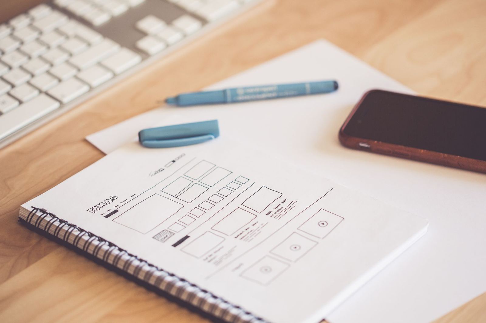
Responsive web design is an approach in which one page adapts its layout to the screen it appears on, using flexible grids, flexible media and CSS rules that respond to the viewport instead of separate sites per device.
It is one of the practical building blocks within ui design principles, and it shapes how every mockup of a screen should be planned.
What responsive layouts are built from
MDN describes the foundation plainly: responsive sites are built on flexible grids, so a designer does not need to target every possible device size with pixel-perfect layouts. Instead of drawing one fixed canvas, the layout is described as relationships: this column takes a share of the width, this image scales with its container, this block moves below its neighbour when space runs out.
Three ingredients recur in almost every responsive build. A fluid grid gives columns proportional widths. Flexible images and video scale inside those columns. Media queries, and increasingly container queries, switch the arrangement at the points where the content stops fitting well.
For a mockup, this changes the deliverable. A single desktop artboard shows only one moment of a layout that continues to change with width, so a responsive design is usually communicated as a small set of representative widths plus notes on how the in-between states behave.
Setting the viewport correctly
Before any breakpoint matters, the page has to tell mobile browsers how wide it wants to be. According to web.dev, pages optimized for a variety of devices must include a meta viewport tag in the head of the document, which tells the browser how to control the page’s dimensions and scaling.
Without it, a phone may render the page as if the screen were a desktop window and then shrink the result, which makes text tiny and defeats every media query written afterwards. This one line in the document head is the most common reason a carefully designed responsive layout appears broken on a real phone while looking fine in a desktop browser with a narrow window.
Media queries and breakpoints
A media query, as MDN defines it, is composed of an optional media type and any number of media feature expressions. The features describe characteristics of the user agent, output device or environment, such as the width of the viewport, whether the primary input can hover, or whether the user prefers reduced motion.
Breakpoints are the widths at which the layout changes. The common advice is to let the content decide. MDN notes that, when breakpoints are used, best practice is to define media query breakpoints with relative units rather than absolute sizes of an individual device. A breakpoint placed where a line of text becomes uncomfortably long or a row of cards starts to look cramped will stay useful as new devices appear; a breakpoint named after one particular phone will not.
Starting from the small screen
MDN describes the mobile-first method: write the default styles for the narrowest layout, then add rules for wider screens once there is enough room to handle multiple columns. The same page explains that designing for mobile first is known as mobile first design. The benefit is mostly one of discipline. The smallest layout forces decisions about priority, because there is only room for what matters, and the wider layouts then add space and secondary content rather than the narrow layout being a stripped-down copy of the desktop.

This ordering also tends to produce lighter pages, since the base styles load for everyone and the extra rules apply only where they are needed.
Container queries and component thinking
Viewport width is only a proxy for the space a component actually has. A card placed in a wide main column and the same card placed in a narrow sidebar can sit on the same screen and need different arrangements. MDN explains that container queries enable you to apply styles to an element based on certain attributes of its container, including the container’s size.
This fits the way design systems are drawn. Each component carries its own responsive behaviour, and the page layout simply gives it room. Mockups benefit too: a component documented at a few container widths is easier to reuse than one drawn only inside a single page.
Designing for touch, not just for width
Screen width is not the only thing that varies. The web.dev guide points out that modern responsive design also accounts for modes of interaction such as touch screens, with the goal of optimizing the experience for everyone. A layout that shrinks correctly can still fail if its controls are too small to tap or sit too close together.
Controls are the clearest example, and the sizing of tap targets is covered in more detail under button design. Hover-only interactions deserve the same scrutiny: a menu that opens on hover has no equivalent on a touch screen unless one is provided.
Responsive behaviour and accessibility overlap in other places as well. Text that reflows instead of scrolling sideways, controls that remain reachable, and layouts that survive zooming are all part of accessible ui design.
Checking a responsive design before it ships
A responsive mockup is only a hypothesis until it meets real content. A practical review pass looks at a handful of situations rather than one fixed device list:
- The narrowest layout, with the longest realistic headline and the longest realistic button label.
- The widest layout, to see whether lines of text become too long or the content floats in empty space.
- Widths between the planned breakpoints, where layouts most often break in unexpected ways.
- Landscape orientation on a phone, which is often forgotten.
- Larger text sizes set in the browser or operating system.
Browser developer tools can resize the viewport and emulate touch, but a real phone shows things an emulator hides, such as how thumbs reach controls and how the browser’s own toolbars change the available height.
Content strategy matters here as much as layout. Long tables, wide data grids and dense navigation menus are the elements that most often resist shrinking, so deciding early how each should behave on a narrow screen, whether by stacking, scrolling inside its own container or collapsing behind a control, saves rework once the visual design is finished.
Images deserve their own plan as well. Artwork that is wide and detailed may need a tighter crop for a phone so that the subject stays legible, and the design notes should say so instead of leaving the decision to whoever implements the page.
Frequently asked questions
What is the difference between responsive and adaptive design?
A responsive layout changes continuously with the available width, using fluid grids and flexible media. An adaptive approach designs a limited number of fixed layouts and picks one for the current screen. Many real sites combine them, with fluid behaviour between a few deliberate layout changes.
Do I need a separate mobile site?
Generally no. A single responsive page serves every device from one set of content and one address, which avoids keeping parallel versions in step. A separate mobile site is a maintenance burden that responsive techniques were developed to avoid.
Should breakpoints match popular device sizes?
Device sizes change constantly, so tying breakpoints to them ages quickly. Placing breakpoints where the content stops working, and expressing them in relative units, holds up better.
How should responsive designs be presented in a mockup?
Show a small set of representative widths, annotate how columns, images and navigation change between them, and note any component that responds to its container rather than to the page.