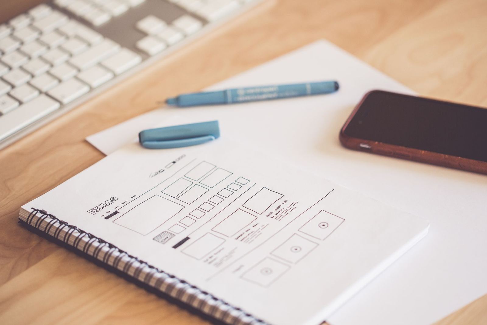

A UI kit is a set of ready-made interface components, such as buttons, inputs, menus and cards, arranged so designers can assemble screens from consistent parts. It speeds up layout work, but it does not by itself decide how those parts should be used.
Kits sit inside the wider practice of ui design principles, where consistency, clarity and feedback guide every interface decision, and they work best when a team understands those principles first.
What a UI kit contains
At its core, a kit is a library of interface building blocks drawn in a design tool. Wikipedia puts the definition bluntly: a UI kit is simply a set of UI components, with no explicit rules provided on its usage. That plain definition explains both the appeal and the limits of the format. The parts are there, but the reasoning behind them is not necessarily included.
Most kits group their material in a similar way:
- Basic elements: buttons, text fields, checkboxes, toggles, sliders and links, usually drawn in every state a person can trigger, such as default, hover, focus, pressed and disabled.
- Navigation: tab bars, sidebars, breadcrumbs, pagination and menus that move a person between screens.
- Containers and feedback: cards, lists, modals, toasts, banners and empty states that hold content or report what the system is doing.
- Style foundations: a colour palette, a type scale, spacing values, corner radii and shadow styles, often stored as named styles or variables in the design file.
- Page templates: assembled layouts for sign-in screens, dashboards, settings pages and checkout flows, showing the components in realistic arrangements.
A kit built for a particular platform also reflects that platform’s conventions. Apple, for instance, describes its design resources as a way to design apps accurately and quickly using official Apple design templates, which shows how a platform owner uses kits to keep third-party apps looking native.
UI kit versus design system
The two terms are often used as if they were interchangeable, yet they cover different ground. A kit is a visual and structural starting point. A design system adds the standards, documentation and governance that explain when and why each part is used.
The Nielsen Norman Group describes a design system as a complete set of standards intended to manage design at scale, built from reusable components and patterns. Within that definition, a kit’s component set is only one layer. The same article lists a style guide, a component library and a pattern library as the usual contents of a design repository, and notes that component libraries cover individual elements while pattern libraries cover groupings and layouts.
In practice, the difference shows up in the questions each can answer:
- A kit shows what a primary button looks like.
- A system also says when a primary button is appropriate, how its label should be written, how it behaves under keyboard control, and which code component implements it.
Many teams begin with a kit because it is quick to adopt, then grow it into a system as the product and the number of contributors expand.
How teams use a UI kit
A kit changes the order of work. Instead of drawing every control from scratch, a designer places instances of kit components on a canvas and adjusts their properties. Because each instance stays linked to its source component, a change to the master propagates to every screen that uses it.
Typical uses include:
- Early exploration. Low-effort screens built from kit parts let a team test flows and layouts before investing in custom visuals.
- Prototyping. Because components are already structured with states and variants, linking them into a clickable prototype is faster than drawing each state again.
- Handoff. Named components and styles give developers a shared vocabulary. The Nielsen Norman Group notes that a design system creates a unified language within and between crossfunctional teams, and a well-named kit starts to do the same job.
- Onboarding. New designers learn a product’s conventions by reading the kit’s structure, which is quicker than reverse-engineering finished screens.
Presentation is a separate use. A kit also helps when preparing mockups of an interface for a client, because the components are consistent and ready to be placed inside a device frame.
Customising a kit without breaking it
Few products can use a kit exactly as supplied. The aim is to adapt it deliberately so that the result still behaves as a coherent set.
Start with the foundations. Replacing the colour, type and spacing styles changes the whole kit in one pass, and the components inherit the new look. That approach is usually safer than editing individual components one by one.
Design tokens formalise the same idea. The Design Tokens Community Group describes tokens as a methodology for expressing design decisions in a platform-agnostic way, so they can be shared across disciplines, tools and technologies. A kit organised around named values such as a primary colour or a base spacing step is much easier to rebrand and to translate into code.
Next, check the details that decide whether an interface is pleasant to use. Components should keep clear focus indicators, labels that make sense out of context and sizes that are comfortable to tap. The page on button design covers how states, sizes and wording affect that most common control, and it is a good test case for any kit before it is adopted widely.
Finally, document the changes. A short note on which components were altered, and why, stops the kit from drifting into a set of near-duplicates that nobody trusts.
Choosing the right kit for a project
A kit is a means to an end, so the choice should follow the product rather than the other way round. Practical questions help:
- Platform fit. Does the kit follow the conventions of the platform the product ships on, or is it generic?
- Coverage. Does it include the states, error handling and empty views the product needs, or only the polished happy path?
- Structure. Are components built with variants and properties rather than flattened shapes, so they can be adapted?
- Maintenance. Is it kept current as design tools and platform guidelines change?
- Terms of use. What does the licence allow for commercial work? The terms vary by source, so read the actual licence and ask the rights holder when anything is unclear. This is general information, not legal advice.
Treat a kit as a starting point for real research. It supplies parts, and the team still has to test the result with the people who will use it.
Frequently asked questions
What is the difference between a UI kit and a component library?
A UI kit usually lives in a design tool and shows how components look. A component library is typically coded and implements those components in a framework. A mature team keeps the two in step so designers and developers refer to the same parts.
Is a UI kit the same as a design system?
No. A kit supplies components, while a design system adds guidelines, patterns, documentation and ownership around them. A kit can be one layer inside a design system.
Can a UI kit be used for mockups?
Yes. Kit components can be assembled into realistic screens and placed inside a device frame to present an interface before it is built. The result is a visual representation rather than working software.
When does a team outgrow a UI kit?
Usually when several people contribute to the same product and need rules, not just parts. Questions about naming, accessibility and code parity signal that it is time to document standards and move toward a design system.