
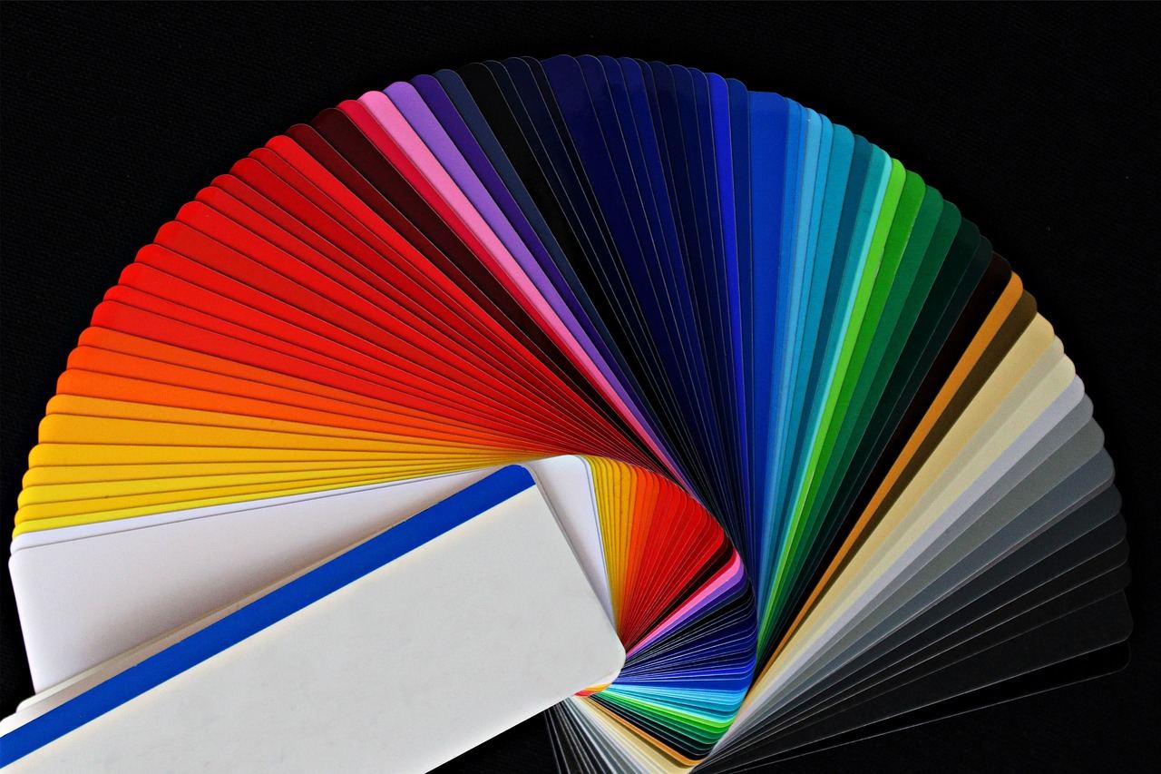
A ui color palette is the fixed set of colours an interface draws from: a brand hue, neutrals, feedback colours and their tints, each with a defined job. A palette holds up when every colour has a role and stays readable.
Colour is one of the core decisions in ui design principles, because it carries hierarchy, state and brand at once. This guide covers roles, harmony, contrast, scales and dark mode.
Define roles before choosing hues
Palettes fail most often because colours are picked for how they look in a swatch, not for what they do on a screen. Start from the jobs an interface needs colour to perform: a primary action colour, a secondary accent, neutrals for text and surfaces, and semantic colours for success, warning, error and information.
Nielsen Norman Group gives a direct rule for this: use colors consistently in your interface. If a bright blue marks calls to action on one screen, it should do so everywhere, and a colour used as a warning on one screen should not be reused for something unrelated elsewhere. Consistency lets people learn the meaning of a colour once and apply it across the product.
Neutrals deserve as much attention as the brand hue. Most of an interface is text, borders and backgrounds, so a thoughtful ladder of greys, ideally tinted slightly toward the brand hue, does more for the overall feel than an extra accent colour.
Use colour harmonies as a starting point
The colour wheel gives a vocabulary for relationships. The same Nielsen Norman Group article lists common harmonies: analogous colours are next to each other on the color wheel, and it describes complementary colours as opposite on the wheel, which produce high color contrast. A monochromatic scheme uses tones and shades of a single hue.
For interface work these map onto practical choices. Monochromatic schemes with a restrained accent feel calm and are easy to keep accessible. Analogous palettes suit content-heavy products where nothing should compete with the text. Complementary pairs are best saved for a single accent, such as a notification badge against a cool interface, because used in large areas they vibrate and tire the eye.
Harmony is a starting point, not a verdict. A palette that is theoretically balanced can still fail if its colours cannot be told apart in a chart, or if the brand hue turns muddy when lightened for a hover state.

Build scales with hue, saturation and lightness
A single hex value is not a palette. Each key colour needs a scale of lighter and darker steps for backgrounds, borders, hover states and text. CSS makes this easier to reason about with perceptually motivated notations. MDN notes that the hsl() functional notation expresses a color in the sRGB color space using hue, saturation and lightness, which lets a designer keep the hue fixed and walk the lightness up and down to produce a ramp.
Two cautions apply. First, equal numeric steps in lightness do not always look equal, and yellows and blues behave very differently at the same value, so each scale needs checking by eye. Second, resist adding steps nobody uses. A compact scale per colour, named by role or step, is easier to maintain than a long list of near duplicates. Teams usually store these values as tokens in a design system, so a change to a single token updates every component.
This is also the point where icons and illustrations join the palette. A set of icon design guidelines normally reuses the neutral and accent steps rather than introducing new colours, which keeps symbols and text visually related.
Check contrast against the standard
Readable colour is a requirement, not a polish step. The Web Content Accessibility Guidelines state that text and images of text have a contrast ratio of at least 4.5:1, with large-scale text allowed a lower ratio of at least 3:1. Both figures are measured between the text colour and the background it sits on, so every text and surface pairing in the palette should be tested, not just the primary button.
Interface elements have their own threshold. The non-text contrast criterion asks for a contrast ratio of at least 3:1 against adjacent color(s) for user interface components and graphical objects, which affects input borders, focus rings, chart lines and icons. A pale grey outline that looks elegant in a mockup can fail this test and leave form fields invisible to many users.
Colour alone should never carry a message. The guidance on use of colour says that colour is not used as the only visual means of conveying information, indicating an action, prompting a response, or distinguishing a visual element. Pair red error states with an icon and text, and give chart series distinct shapes or direct labels as well as distinct hues.
Plan for dark mode and system preferences
Many people choose a dark appearance at operating system level. MDN explains that the prefers-color-scheme media feature is used to detect if a user has requested light or dark color themes, so a product can respond without its own toggle. The CSS colour documentation also describes a function that uses the first colour for light colour schemes and the second for dark colour schemes, which keeps both values side by side in one declaration.
A dark palette is not an inversion of a light one. Pure black surfaces with bright saturated accents create glare, so dark themes usually use deep, slightly tinted greys and softer, less saturated accent steps. Elevation, which light interfaces show with shadows, is often shown in dark interfaces by lightening the surface. Re-run every contrast check for the dark pairings, since passing in one theme guarantees nothing about the other.
Test the palette in context
Swatches hide problems that real screens reveal. Apply the palette to representative components: a form with every state, a data table, an alert, a chart and a card. Squint, view it at low brightness and in greyscale, and look for places where hierarchy depends on hue alone.
Layout affects colour perception as well. Large areas of saturated colour overwhelm, while small accents on neutral ground draw attention precisely. Sizes, gutters and spacing set how much colour appears at once, which is why palette decisions are best reviewed alongside the page structure described in guides to grid system web design.
Frequently asked questions
How many colours should a UI palette have?
There is no fixed number. Most interfaces need a primary hue, a neutral scale, and a small set of semantic colours, each with a few tints and shades. Add a colour only when it has a distinct role.
What is the difference between a brand palette and a UI palette?
A brand palette focuses on identity and print as well as screen. A UI palette adds the tints, states and semantic colours an interface needs, and every pairing has to meet contrast requirements.
Should I design in light mode or dark mode first?
Either order works if both are planned together. Define roles rather than raw values, then assign a light and a dark value to each role and test contrast for both.
How do I check whether my colours are accessible?
Measure the contrast ratio of each text and background pair and each interface component against the standard in WCAG, and confirm that no message depends on colour alone.