What is a design mockup? It is a static, realistic-looking picture of a design, such as a screen, a package or a printed piece, made to show how the finished result will look before anything is built or produced.
This guide is the starting point for the topic on this independent information site, and each section points to a deeper article on one part of it.
What a design mockup is and why designers make one
A design is easy to describe and hard to judge from a description. A mockup closes that gap. It takes the visual decisions made so far, such as colour, typography, imagery, spacing and logo placement, and shows them on a believable surface: a phone screen, a cardboard box, a shopfront sign, a sheet of letterhead. Because it looks close to the real thing, people who are not designers can react to it with confidence.
The word covers two quite different situations. In interface work, a mockup is usually a detailed, static visual of a screen or page, with final colours, type and imagery but no working behaviour. In graphic, branding and product work, a mockup usually means a design placed into a realistic scene or onto a product shape, so that a logo, label or layout is seen in context rather than floating on a blank canvas. Both uses share the same purpose: to make a decision easier by removing the need to imagine.
That purpose explains where mockups earn their place. A client can approve a direction before print costs are committed. A developer can see the exact spacing and type sizes that the design calls for. A stakeholder can compare two directions side by side without reading a specification. A designer can notice problems that a flat artboard hides, such as a logo that looks fine on screen but disappears against the colour of a bag, or a headline that wraps awkwardly on a narrow display.
A mockup is also limited by what it is. It is a picture, so it can flatter a design: perfect lighting, a generous crop and a conveniently chosen surface can all make weak work look strong. Good practice is to treat the mockup as evidence about the design rather than as a substitute for testing it, which is the theme of the later sections.
Mockups, wireframes and prototypes compared
Three terms are often used loosely, and mixing them up leads to the wrong feedback at the wrong time. A wireframe is a structural sketch: boxes, labels and placeholder text that show what goes where, with no attempt at style. A mockup adds the visual layer. A prototype adds behaviour, so that a person can click, tap or move through the design. The article on mockup vs wireframe vs prototype sets out where each one fits in a project and what to ask reviewers at each stage.
Nielsen Norman Group offers a useful way to think about the differences. It explains that the fidelity of a prototype refers to how closely it matches the look-and-feel of the final system, and that fidelity can vary in interactivity, visuals, and content and commands. The same idea applies to mockups. A rough grey-box layout and a polished, photographic scene are both mockups of a kind, but they sit at opposite ends of the visual-fidelity range and invite different reactions.
Matching fidelity to the question being asked saves effort. Early on, when the question is whether the structure makes sense, a polished visual draws attention to colours and fonts that will change anyway. Later, when the question is whether the identity feels right on a real product, a rough sketch cannot answer it. The practical rule is to raise fidelity only as far as the current decision needs.
The same source also points out that people tend to judge an unfinished-looking design more gently, since a design that appears incomplete leaves reviewers with little sense of how long it took to make. That is a reason to keep early visuals plain, and to save the polished presentation for the point when the main decisions have already been settled.
The main kinds of mockup and what each is used for
Mockups are usually grouped by what they show. The grouping matters because each kind has its own conventions for angle, lighting, scale and realism, and each answers a different question.
- Screen and device presentations. These place an app or website design inside the frame of a phone, tablet, laptop or monitor. They are used in case studies, store listings and client reviews. The article on device mockups covers framing, screen content and how to keep the device from competing with the design.
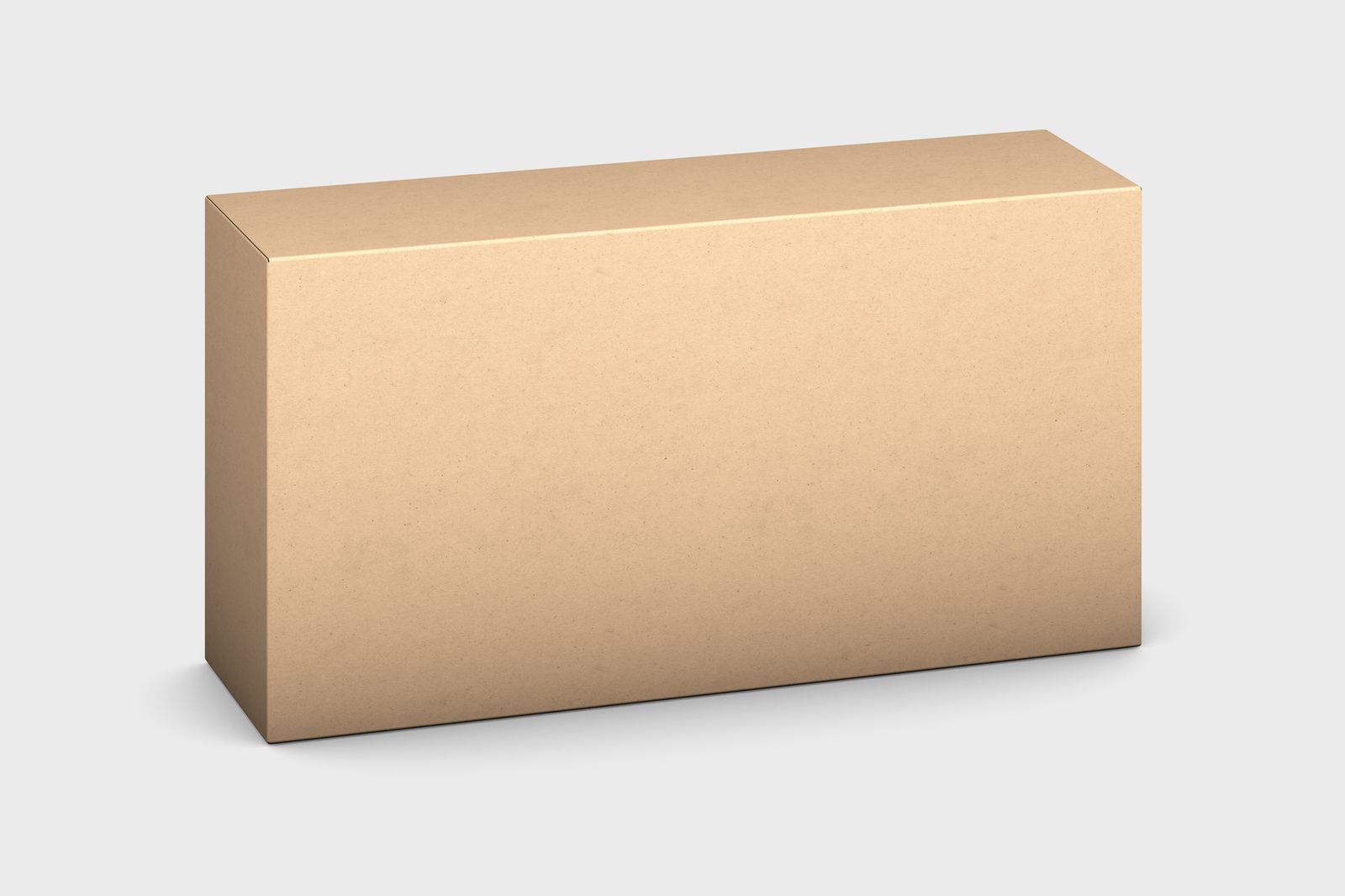
- Packaging. Boxes, bags, bottles and tubes involve curved surfaces, folds and printing constraints. A packaging mockup lets a label or carton design be judged as a three-dimensional object before dielines are sent to a printer.
- Identity and branding. A logo seldom lives alone. A branding mockup shows it on stationery, signage, vehicles and merchandise so a client can see the system working together rather than a single mark on white.
- Apparel and merchandise. Garments add fabric folds, colour variants and print areas. A t-shirt mockup is among the most common examples, and the article explains how placement and perspective change how a graphic reads.
- Print. Posters, flyers, cards and letterheads are judged by paper, finish and size as much as by artwork. A print mockup helps show those qualities on screen.
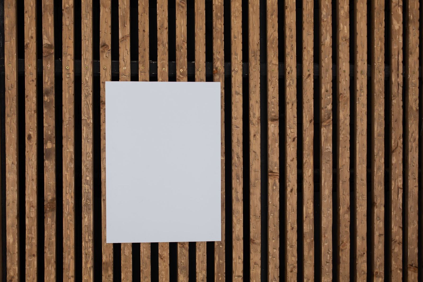
Beyond these categories, the choice of scene deserves thought. A mockup built on a cluttered or heavily styled background pulls the eye away from the design. A mockup whose lighting disagrees with the design, for instance a flat, evenly lit artwork pasted onto a dramatically shadowed surface, looks false at once. Readers who prefer to build their own scenes rather than rely on pre-made ones can read about mockup photography, which covers light, angles and blank surfaces.
How a mockup is built in practice
Most mockups, whatever the subject, follow the same build pattern. A base image supplies the scene: a photograph or rendered picture of an object with a blank area where the design will go. A placeholder layer marks that area. The design is dropped into the placeholder, and the editor adjusts it to follow the surface, using perspective, warping, masking, shadows and highlights so that the artwork appears to belong to the object rather than sit on top of it.
Raster editors make this repeatable by letting a design live inside a replaceable layer, so the scene stays untouched and only the artwork is swapped. In Photoshop this layer is called a smart object, and working with it properly means understanding how editing the contents differs from editing the container. The article on the photoshop smart object mockup workflow walks through that technique, including how to keep artwork sharp when it is scaled and transformed.
Not every mockup needs a raster editor. Interface designers often build screens directly in vector-based design software, where components, frames and layout rules replace photographic scenes. The article on how to make a figma mockup explains how a design can be presented and shared without opening Photoshop, which suits teams that already work in the browser.
Whichever route is used, a few habits make the result more convincing and easier to update:
- Keep the scene, the artwork and the shadows on separate layers, so any of them can change without redoing the others.
- Match the artwork to the surface. A matte paper stock, a glossy bottle and a ribbed cotton fabric each change how colour and edges appear.
- Check the scale. A logo that is sensible on a screen can be absurdly large or small on a real object, and the mockup should show that honestly.
- Export at a size suited to where the image will be used, and review it at the size a viewer will actually see.
Keeping a mockup honest, readable and usable
A mockup of an interface is only a fair preview if it respects the constraints of the real medium. Text needs enough contrast to be read. The Web Content Accessibility Guidelines state that the visual presentation of text and images of text has a contrast ratio of at least 4.5:1, with large-scale text held to a lower ratio of at least 3:1. A mockup with pale grey text on white may look elegant in a presentation and still fail the people who will use the product, so checking contrast during the mockup stage is far cheaper than discovering the problem after launch.
Layout is the second area where mockups can mislead. A single polished screen at one width suggests a certain look, but real pages are viewed on many screen sizes. Guidance from web.dev explains that a page without the viewport meta tag loads very zoomed out, making the text hard to read, which is one of several reasons that an interface mockup should be accompanied by narrower and wider versions of the same layout, not just a single desktop view.
Images are a third concern. Mozilla’s documentation describes the problem as one where there is no need to embed such large images on the page if it is being viewed on a mobile screen, because doing so wastes bandwidth. A mockup that relies on huge photographic backgrounds can hide the fact that those assets will have to be prepared in several sizes before the design can ship.
Finally, the content shown in a mockup should resemble the content that will really appear. Short, tidy placeholder headings and perfectly cropped photographs conceal how a layout behaves with a long title, a missing image or a translated label. Using realistic text and awkward cases gives reviewers a truer picture, and it keeps the mockup from becoming a promise that production cannot keep.

Common mistakes that weaken a mockup
Several habits recur in mockups that fail to persuade. The first is letting the scene overpower the design: heavy props, strong colour casts and dramatic depth of field can turn a presentation into a picture of the props. The second is inconsistency across a set. When a series of mockups for one identity uses different angles, lighting and surfaces, the brand looks less coherent than it really is, and a reviewer may blame the design for what is only a presentation problem.
A third mistake is stretching or distorting artwork to fit a placeholder. A logo squeezed to fill a label area, or text warped without regard for the surface, signals carelessness even to viewers who cannot say why the image feels wrong. It is better to adjust the placement, or to change the base scene, than to bend the design out of shape.
A fourth is ignoring the edges of the real object. Seams, folds, stitching, borders and bleed areas are where designs meet manufacturing limits, and a mockup that shows artwork running smoothly across a fold that could never be printed that way sets false expectations. Showing the design within its true printable area makes the review more useful and avoids unwelcome surprises when production begins.
Rights, licences and using templates responsibly
Mockups often start from a pre-made scene, which raises a question that is easy to overlook: what is the person making the mockup allowed to do with it? The U.S. Copyright Office explains that copyright protects original works of authorship as soon as an author fixes the work in a tangible form of expression. A photograph of an object, a layered scene file and the artwork placed into it can each carry rights, held by different people.
The same office lists the exclusive rights that copyright gives its owner, including the right to prepare derivative works based upon the work, and it adds that the owner can authorise others to exercise those rights. In practice, what a template user may do is set by the terms attached to that template, which can differ on commercial use, client work, resale, attribution and redistribution. The article on the mockup license terms explains the common clauses and how to read them before a piece is shown to a client or published.
This is general information, not legal advice. When the terms are unclear, the sensible course is to read the actual licence in full and ask the rights holder before using the material in a project.
Rights also cover what goes inside the mockup. Logos, photographs and fonts used in the artwork have their own terms, and a mockup that includes someone else’s trademark or an unlicensed typeface can create problems that the scene itself never would. Treating every element as something that needs a clear permission keeps a presentation safe to share.
How mockups connect to the rest of the design process
A mockup rarely stands alone. It sits between structural planning and the final build, and it draws on two other disciplines: type and interface design. The typefaces, sizes and spacing shown in a mockup are decisions that the guide to typography basics explains in more depth, and the layout, hierarchy and interaction patterns in a screen mockup follow the ideas collected in the guide to ui design principles.
The way a mockup is discussed matters too. Nielsen Norman Group defines a design critique as analyzing a design, and giving feedback on whether it meets its objectives, and stresses that it does not mean simply judging a design. Presenting a mockup alongside its objectives, such as who it is for and what it needs to achieve, steers the conversation away from personal taste and toward whether the work does its job.
A sensible sequence for many projects is to settle structure with wireframes, explore appearance with mockups at a fidelity that fits the decision, test behaviour with a prototype where interaction matters, and revisit the mockup when feedback demands a change. Keeping the mockup files organised, with named layers, a consistent scene and clearly stored artwork, makes each of those loops faster.
Frequently asked questions
Is a mockup the same as a prototype?
No. A mockup is a static visual that shows how a design looks, while a prototype adds behaviour so that people can try interactions. A mockup can be a starting point for a prototype, and the two are often produced from the same design file.
Does a mockup need to be photorealistic?
Not always. The level of realism should match the decision being made. A simple, clean presentation is enough to judge colour and layout, while a photographic scene is more useful when a design must be judged on a physical product or in a real setting.
Do mockups replace testing with real users?
No. A mockup shows appearance, and it can flatter a design through careful lighting and cropping. Testing with real people shows whether the design is understood and usable, and mockups are best treated as one input to that process.
Can any mockup be used for client work?
That depends on the terms attached to the scene or template. Some terms limit commercial use, resale or redistribution. Reading the licence and asking the rights holder when anything is unclear is the safest approach.
Which software is used to make mockups?
Raster editors and vector-based interface design tools are both common. The choice depends on whether the mockup places artwork into a photographic scene or presents an interface made of screens and components.