A print mockup is a realistic preview of printed material, such as a poster, business card or letterhead, placed on a paper surface or in a scene before anything goes to press. It lets clients judge layout, colour and format early.
It is one of the main formats covered in the guide to what is a design mockup, and it carries extra responsibilities because paper, ink and trimming behave differently from a screen.
What a print mockup has to get right
A screen mockup only needs to look convincing. A print mockup also has to be honest about the physical product. The preview should show the correct proportions, a believable stock, and edges that match how the piece will actually be cut. If the artwork underneath is not prepared for press, the mockup can look perfect while the printed result disappoints.
That is why the work divides into two stages. The first is preparing the artwork correctly: size, bleed, colour mode and file format. The second is placing that artwork into a presentation scene. Doing them in that order means the mockup reflects a file that is genuinely ready, rather than hiding problems behind soft shadows.
Trim, bleed and safe area
Printed sheets are cut down after printing, and cutting is never perfectly exact. Bleed is the extra artwork that extends past the trim line so that a small cutting shift does not leave a blank strip. According to Wikipedia’s entry on bleed, a standard bleed is about one-eighth of an inch or very similar 3 mm, and for posters, an extra 0.25 inches (6.35mm) is usually allowed on all sides for large-format work.
The same source explains the consequence of leaving it out: failing to provide bleed information and crop marks can result in finished pieces showing a thin area of white on the edge. Printers differ in their requirements, and as that page notes, some printers ask for specific sizes, so the printer’s own template or specification sheet takes priority over any general figure.
Alongside bleed sits the safe area: an inner margin where text and logos stay clear of the trim. A mockup should show the trimmed result, so the bleed is hidden in the presentation, but the artwork behind it should still carry the extra margin. For a piece that runs to the paper edge, the term to know is full bleed, defined as printing from one edge of the paper to the other.
Business cards illustrate why this matters in small formats. The Wikipedia article on business cards notes that the image on the paper can also shift from page to page which is called a bounce. On a small card, a tiny shift is a visible fraction of the layout, which is the reason borders and thin keylines tend to look uneven.
Colour: from screen to ink
Designs are usually built on a screen that emits light, while print reproduces colour with ink on paper. Wikipedia describes the CMYK model as a subtractive color model used in color printing, in contrast to screen colour, where colors are produced by emitting light. Some bright screen colours simply cannot be reproduced in ink, and they shift when converted.
Colour management exists to reduce that gap. A general explanation from the same encyclopedia says that a monitor may display colors differently than a printer can reproduce them, and that without color management, the same image may appear differently on different devices. For a mockup, the practical lesson is that a vivid on-screen preview can overpromise. Converting the artwork using the printer’s recommended profile and checking the converted result before presenting avoids an unpleasant surprise later.
Paper itself changes the picture. Uncoated stock absorbs ink and looks softer, while coated stock keeps colour crisper. A convincing mockup shows this by using a matching texture on the paper surface and a gentler shadow, rather than a glossy, glowing rendering for a matte job.
Common formats and their sizes
Different regions use different standards, and the mockup frame should match the real product. In much of the world, sheet sizes follow the ISO 216 family, where A4 is the most commonly available paper size worldwide. North America uses its own sheet sizes, so the first step is to confirm the market and the printer.
Sizes also differ by region: business cards in Western Europe (85 × 55 mm) are one example, so a card mockup should use the dimensions of the target market rather than a default template. Stationery sets generally combine a card, a letterhead and an envelope, each with its own proportions, so each should be a separate, correctly sized artboard.
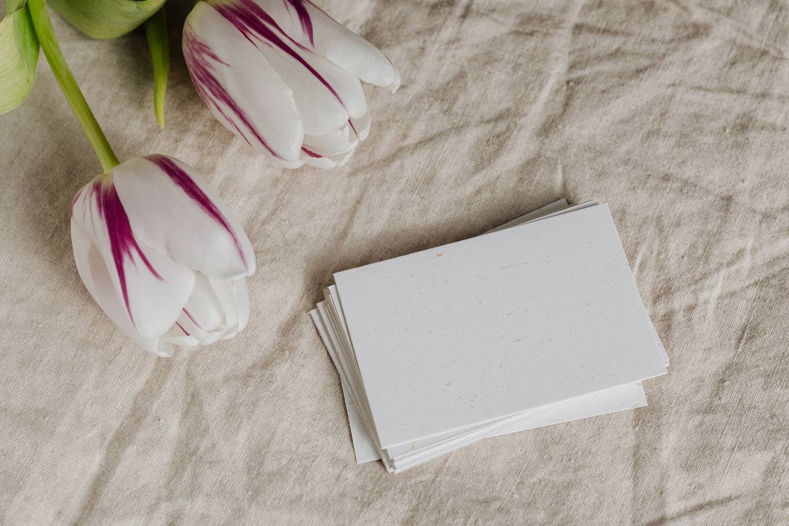
A business card is, in the words of the encyclopedia, cards bearing business information about a company or individual. Its small size means legibility, not decoration, should drive type choices on the artwork before it is placed in any scene.
Proofing and presenting
A mockup is a persuasion tool, while a proof is a verification tool, and the two should not be confused. In prepress, proofing involves creating an accurate copy of the artwork before beginning production runs. A digital preview is a soft proof, and the same source describes how soft proofs are digital proofs that simulate accurately how the finished publication will look. A scene mockup does not do this job, because its lighting and paper are staged.
When the work moves to the printer, files are typically supplied in a standard format: the artwork is quite often provided by the customer as a print-ready PDF file. Clients should understand that the approved mockup is an agreement about direction, while the printer’s proof is the check on production quality.
Building the scene
With correct artwork in hand, the scene can be assembled in several ways. A design tool can place flat artwork on a drawn surface, as covered in the article on building a figma mockup. A raster editor can place the artwork on a photographed surface, which the guide to the photoshop smart object mockup workflow explains in detail.
Whichever route is used, a few habits keep a print scene credible. Keep the lighting direction consistent across all items in a set. Let paper edges show a slight thickness. Match the shadow softness to the surface the sheet rests on. Avoid placing a single sharp item among blurry ones, since the eye reads that mismatch as artificial.
Frequently asked questions
Should a print mockup show the bleed?
No. The mockup should show the trimmed result, as the customer will receive it. The artwork behind it should still include bleed so the real file is ready for the printer.
Why do printed colours look different from the mockup?
Screens emit light and print uses ink on paper, so some colours shift or become duller. Converting with the printer’s recommended profile and viewing a proof reduces the difference.
Is a mockup the same as a proof?
No. A mockup communicates the idea in a staged scene, whereas a proof is a faithful check of the file that will be printed.
Which size should be used for a business card mockup?
Use the size of the actual card for the target market and printer, since standards differ by region. The printer’s specification sheet is the reliable reference.