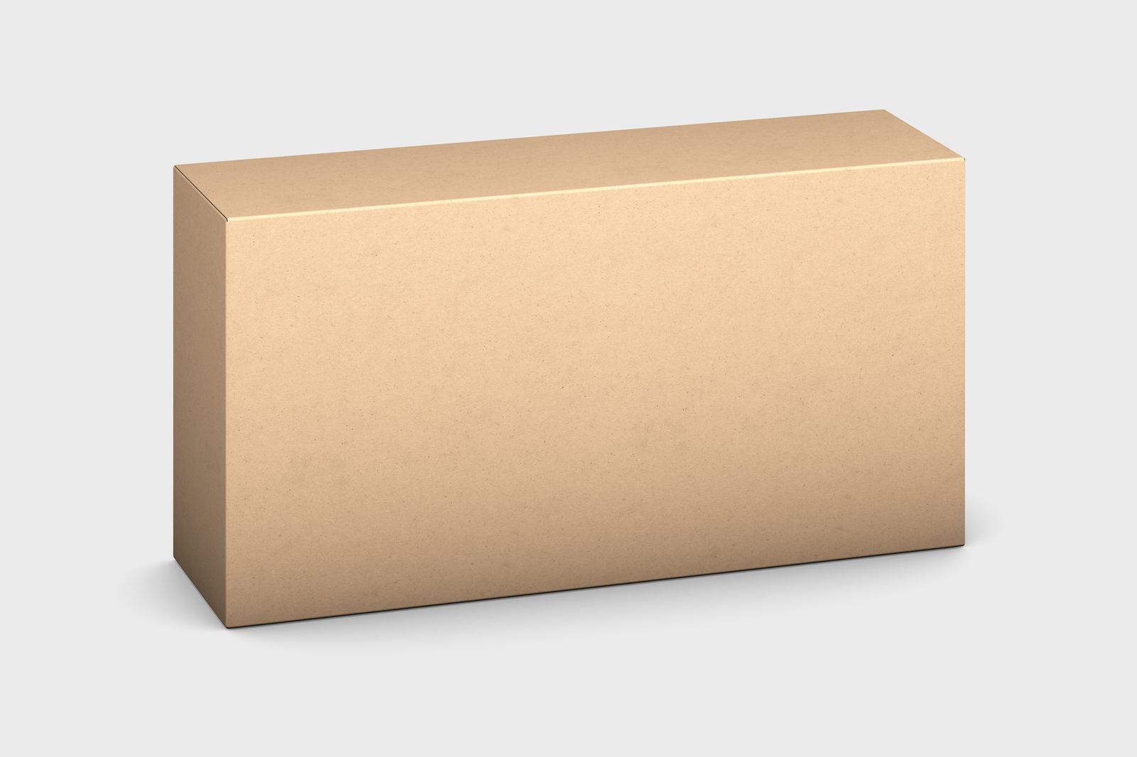
A packaging mockup is a realistic image of a box, bag, bottle or label, built from flat artwork before anything is printed. It lets designers and clients judge shape, colour and legibility, and catch problems while changes are still cheap.
It is one format within the broader practice of what is a design mockup, and it follows the same logic as device mockups: place a flat design in a believable object so people can react to it properly.
What a packaging mockup shows
As Wikipedia puts it, a mockup is a model used for teaching, demonstration, design evaluation, promotion, and other purposes. For packaging, those purposes are easy to see. A flat dieline looks nothing like a finished carton, so a rendered or photographed preview does much of the explaining.
A good preview answers practical questions. Does the logo sit where the eye lands when the box is picked up? Does the front panel still read when the pack is seen at a distance on a shelf? Do the colours hold up once light, shadow and material finish are applied? Those answers shape decisions about hierarchy, type size and imagery long before a printer is involved.
Packaging mockups come in broad families: rigid and folding boxes, pouches and bags, bottles and jars, tubes, cans, labels and sleeves. Each family brings its own geometry, which affects how artwork wraps around the object and which panels are visible in a single view.
From flat artwork to a three-dimensional preview
Almost every packaging project starts with a flat layout, often called a dieline: an outline showing the cut and fold lines of the finished pack. Artwork is arranged inside that outline, with each panel positioned so it lands on the right face when the pack is assembled.
Folding cartons illustrate why this matters. According to Wikipedia, the cartons are shipped flat to a packager, which has its own machinery to fold the carton into its final shape as a container for a product. The design therefore has to work as a flat sheet and as a folded object, and a mockup is the bridge between the two views.
The usual workflow follows a consistent pattern:
- Prepare the flat artwork on the dieline, keeping every panel clearly separated and labelled.
- Place the artwork into the mockup scene, either by replacing a placeholder layer or by mapping a texture onto a three-dimensional model.
- Adjust lighting, material and background so the result looks like a photograph rather than a diagram.
- Export views suited to the audience: a hero angle for a presentation, a set of faces for a review and a close-up for finish details.
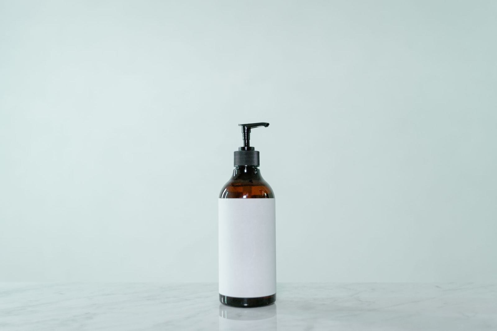
Tools differ, but the underlying idea is stable. Raster editors use replaceable layers, three-dimensional applications wrap a texture around a model, and some design tools can approximate the effect with distortion and shading. The more complex the shape, the more convincing a fully modelled approach tends to be.
Colour, print and finish considerations
Screens and presses produce colour in different ways, and packaging mockups sit exactly on that boundary. Most print production relies on the CMYK system, which, as Wikipedia notes, refers to the four colour components used in printing. Screen previews are built from light, so saturated colours on a monitor may look duller on paper.
A mockup is therefore a guide to composition and mood, not a colour guarantee. When accuracy matters, ask the printer for a proof. Per Wikipedia’s prepress article, proofing involves creating an accurate copy of the artwork before beginning production runs. That is the stage where colour is actually verified against the agreed standard, and no on-screen mockup replaces it.
Finishes also behave differently in a render than in the hand. Foil, embossing, varnish, soft-touch coatings and textured stocks can be simulated, but the effect depends on how the mockup handles reflections and depth. Treat simulated finishes as indications and confirm them with a physical sample when they are important to the brand.
Bleed, trim and safe areas
Printed packaging is cut and folded, and cutting is never perfectly precise. That is why artwork extends past the trim line. Wikipedia explains that bleed gives the printer a small amount of space to account for natural movement of the paper during guillotining, and that after trimming the bleed ensures that no unprinted edges occur in the final trimmed document.
A mockup can hide errors that matter in production. If a scene shows a perfectly wrapped box, a missing bleed or a logo sitting too close to a fold may go unnoticed. Review the flat artwork separately for these points:
- Background colours and images extend into the bleed area on every outer edge.
- Important text and logos stay inside a safe margin away from trim and fold lines.
- Panels that meet at a fold line align, so graphics continue naturally around the corner.
- Glue flaps, seams and closures are kept clear of key elements.
The printer or packaging supplier normally provides the exact dimensions for bleed and margins for a given construction. Use those figures over any general rule of thumb.
Labels, regulation and legibility
For consumer products, a packaging mockup is also a chance to test whether required information fits. In the United States, the food-labelling rules define the front of a food package in specific terms: the principal display panel is the part of a label that is most likely to be displayed, presented, shown, or examined under customary conditions of display for retail sale.
That definition is a reminder that the panel facing a shopper carries both brand and compliance work. Regulated categories such as food, supplements, cosmetics and chemicals each have their own labelling requirements, and they differ between countries. Designers usually confirm the required statements with the client or a regulatory specialist, then build the layout around them. The mockup can then show whether mandatory text remains readable without crowding the brand.
Legibility holds across every category. Test the design at a realistic viewing distance, on a curved or angled surface and under the lighting of the retail setting. Small type that reads on a monitor can fail on a bottle with a tight curvature.
Presenting packaging to a client
How a mockup is presented influences how it is judged. A single hero image looks polished but may hide weak panels, so a presentation usually includes the front, the sides and, where relevant, the top and base. Showing a line of related products together helps clients judge consistency across variants, flavours or sizes.
Context helps too. A pack on a neutral background keeps attention on the design, while a shelf or lifestyle scene shows how it competes with neighbours. Real photographs of printed samples remain the most trustworthy evidence, and teams often move from digital mockups to white samples and then to press-checked prototypes as a project advances.
Branding work often travels alongside packaging, and a branding mockup covers how logos and identity systems appear across stationery, signage and merchandise.
Frequently asked questions
Is a packaging mockup the same as a prototype?
Not exactly. A mockup is a visual preview, usually an image. A prototype is a physical or functional sample, such as a printed and assembled carton, used to test construction and fit.
Can a mockup show exact print colours?
No. Screens emit light while print reflects it, so a mockup indicates mood and balance rather than final colour. A printer’s proof is the dependable way to confirm colour before a production run.
What file should the artwork be in before it goes into a mockup?
Use the flat dieline layout with every panel in place, ideally as vector artwork or high-resolution images. Keep text, bleed and safe margins on separate, clearly named layers so they can be edited easily.
Do packaging mockups need to follow labelling rules?
Mockups for real products should include required label information in the right positions, since layout decisions depend on it. Requirements vary by product type and country, so confirm them with the client or a specialist.