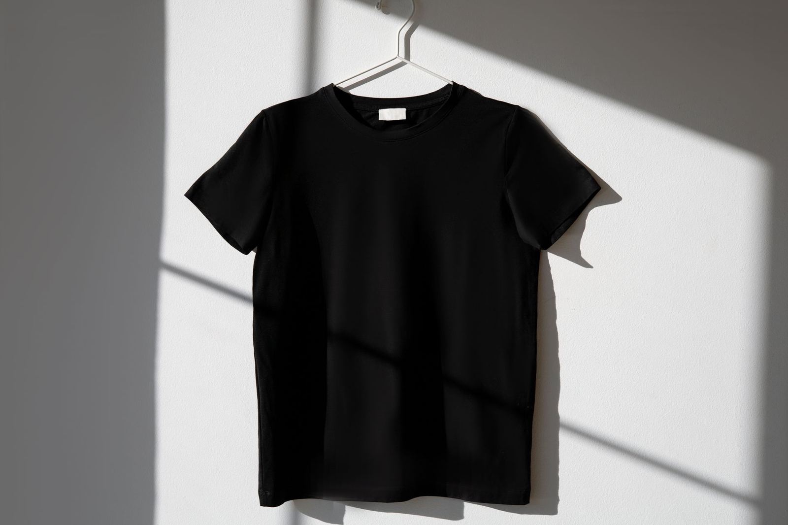
A t-shirt mockup is a realistic preview that shows a graphic printed on a shirt before any garment is produced. A convincing one depends on fabric behavior, honest colour and the print method the design will actually use.
Apparel previews are one application of the broader practice covered in what is a design mockup, and they come with their own traps: folds, ink limits and the gap between a screen and a cotton surface.
What an apparel mockup is for
In manufacturing and design, a mockup is a scale or full-size model of a design or device, used for teaching, demonstration, design evaluation, promotion and other purposes. For clothing, the model is usually a flat digital image of a shirt, hoodie or cap with artwork placed on it. The purpose is to judge placement, scale and colour before committing to a print run or a sample.
It helps to separate the jobs a garment preview can do. A presentation preview sells an idea to a client or a team, so it can be polished and flattering. A production preview has to be faithful, because someone will compare the printed result with it. Treating a presentation image as a production promise is the most common cause of disappointment, and it is worth deciding up front which kind is being made.
Choose the print method before you build the preview
The same artwork looks different depending on how it reaches the fabric, so the method should shape the mockup rather than follow it. The main methods cover most apparel work.
Screen printing
In screen printing, ink is pushed through a mesh in areas that a stencil leaves open. As described on Wikipedia, each colour is printed separately, so several screens are used to produce a multi-coloured image. That makes the colour count a real design constraint: a mockup with a smooth photographic gradient suggests something this method does not naturally produce.
Direct-to-garment
Direct-to-garment printing is a process of printing on textiles using specialized aqueous inkjet technology. The same source notes that the garment typically has to be pre-treated, which affects how the finished print sits on the fabric. Photographic and many-coloured artwork suits this approach, so a mockup of detailed artwork is more believable here than for a stencil-based method.
Heat transfer vinyl
Heat transfer vinyl is a type of plastic film used on certain fabrics to apply designs to apparel such as T-shirts. The design is cut from the film, and the excess is removed by hand with tools such as hooks or tweezers. Because shapes are cut, fine hairlines and tiny details are unrealistic, and a preview should show solid, simple forms.
Dye sublimation
In direct dye-sublimation fabric printing, an inkjet printer prints dye-sublimation inks directly onto the fabric, which is then heated to diffuse and set the dyes. Because the dye becomes part of the material, this method suits all-over designs, and a mockup can sensibly show artwork running across seams.
Build realism into the template
Whether a template is made in a raster editor or in a vector tool, believable apparel previews tend to share the same layered structure. Understanding it makes any template easier to use and easier to repair.
- Garment base. A clean image of the shirt, ideally photographed or rendered on a neutral background, carries the shadows and folds.
- Print area. A replaceable layer, often a smart object or a component, marks where artwork goes. Its edges should follow the garment’s silhouette.
- Shading layer. Folds and creases are multiplied over the artwork so the print appears to sit in the fabric instead of floating on top.
- Colour layer. A separate tint for the fabric lets the same shirt be shown in several colours without re-shooting it.
The shading layer does the heavy lifting. If artwork ignores a deep fold across the chest, the eye reads it as pasted. Some editors also offer a displacement or warp feature, which bends the artwork to follow the surface. It should be used lightly: a slight bend suggests fabric, while an exaggerated one distorts logos and lettering that a client will scrutinise.
Where the base garment is a photograph, lighting and angle matter as much as the artwork. The principles in mockup photography apply directly: soft, even light, a plain background and a camera angle that keeps the print area readable.
Colour accuracy and ink limits
Screens emit light and fabric reflects it, so a bright on-screen colour will almost always look quieter when printed. A responsible preview signals this instead of hiding it. Practical habits include keeping artwork in the colour mode the printer requests, naming spot colours the way the print shop does and checking a physical proof for any colour that must match a brand standard.
Fabric colour matters just as much. Light ink on a dark garment usually needs an underlayer, and some methods struggle to reproduce white or pale tones at all. A mockup that shows pale artwork glowing on black cotton may be asking for something the chosen process cannot do without extra steps. When the method is known, test the preview against its limits: reduce the colour count for stencil-based printing, simplify the shapes for cut vinyl and avoid unprintable fine detail.
Placement, scale and presentation
Placement is a large part of what a garment preview communicates. A chest print, a left-chest logo, a sleeve mark and a back yoke each read differently and cost differently. Keep proportions honest by scaling artwork relative to the garment, not relative to the canvas, and match the proportions of the actual size range the shirt will be produced in. The same graphic that looks bold on a medium shirt can look lost on a large one.
Presentation choices follow the audience. For a client review, show the front, back and a close-up of the print so decisions are made on real detail. For a storefront or portfolio, a worn-on-body scene or a folded stack gives context, though context scenes hide placement precision. In every case, keep the shirt itself generic. Third-party logos, team marks and brand names on a sample garment can raise trademark questions: the US Patent and Trademark Office explains that a trademark identifies the source of goods or services, so a recognisable mark on a shirt signals a source whether or not that was intended.
Checking the template terms
Garment templates are made by photographers, illustrators and studios who set terms for how the file can be used. Some limit use to personal projects, some allow client work, and some restrict redistribution or require credit. Reading the mockup license before building a presentation around a template avoids the awkward discovery that a pitch deck or storefront image was not permitted. When the terms are unclear, ask the rights holder.
A short review checklist
- Confirm the print method and trim the design to what it can produce.
- Check that fold shading is visible through the artwork.
- Compare the preview colours with any printed proof before approval.
- Verify that the print area is in proportion to the garment size.
- Remove third-party marks that are not part of the brief.
- Confirm the template terms cover the intended use.
Frequently asked questions
What is the difference between a flat and a worn t-shirt mockup?
A flat preview shows the garment laid out front-on, which makes placement and artwork easy to judge. A worn preview adds a body, creases and context, which suits storefronts and social posts but hides precise placement.
Can a mockup show the exact colour of the printed shirt?
Not reliably. Screens and fabric reproduce colour differently, so a preview is a guide. A physical proof from the print supplier is the dependable check for colour-critical work.
Does the print method change how the artwork should be prepared?
Yes. Stencil-based printing limits the colour count, cut vinyl limits detail, and digital methods allow photographic images. Prepare the artwork and the preview for the method that will be used.
Do hoodies need a different mockup approach?
The principles are the same, but hoodies add a pocket, seams and thicker folds that interrupt large prints. The shading layer and placement should account for them.