Device mockups place an app or website design inside a realistic phone, tablet, laptop or desktop frame, so stakeholders judge it as a user would meet it. They suit presentations, case studies and store pages rather than build handoff.
The wider idea is covered in what is a design mockup, which explains how static visuals differ from working prototypes; this guide narrows in on the device frame itself.
What a device mockup does
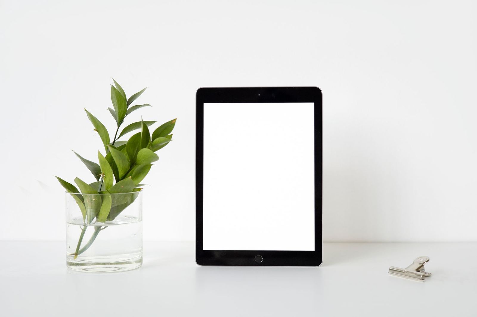
A mockup is, in the words of Wikipedia, a model of a design or device used for teaching, demonstration, design evaluation, promotion, and other purposes. A device mockup applies that idea to screens: the interface sits on a believable handset or monitor, complete with bezel, shadow and a hint of the surrounding desk or hand.
The frame answers a question that a flat screenshot cannot. Reviewers see how large the interface really is relative to a thumb, how much empty space surrounds the content and whether the layout reads at arm’s length. That context makes feedback more concrete than comments on a bare artboard.
The same source adds that a mockup may be a prototype when it provides at least part of the functionality of a system, according to the same article. Most device mockups do not. They are pictures, and the difference matters when a client expects to tap through screens. For the distinction in detail, see mockup vs wireframe vs prototype.
Common uses for device frames
Device frames earn their place in a few recurring situations, each with its own priorities.
- Client presentations. A finished screen shown inside a phone frame feels closer to a real product and helps non-designers react to the whole experience rather than individual pixels.
- Portfolio and case studies. A designer showing work to hiring managers can use frames to group screens, show a flow in sequence and make small details legible.
- Store listings and marketing pages. Product pages for apps often combine screenshots with captions and a frame. The platform rules decide what is allowed, as covered below.
- Pitch decks and documentation. A single laptop or phone image can carry an idea on a slide faster than a paragraph of text.
In each case the frame is supporting evidence, not the subject. A strong mockup keeps attention on the interface and uses the device only to supply scale and context.
Choosing the right device and angle
The device should match where the product will actually be used. A banking app belongs in a phone, a data dashboard in a laptop or wide monitor, and a responsive marketing site often benefits from showing several screen sizes together to demonstrate that the layout adapts.
Angle and perspective set the tone. A straight-on, flat view is the most honest: it shows the interface without distortion and is the best choice when details must be read. A tilted or isometric view feels more dynamic and works for hero images, but it foreshortens text and can hide edge content. A hand holding a phone adds scale and warmth, though it also introduces cropping and shadows that compete with the screen.
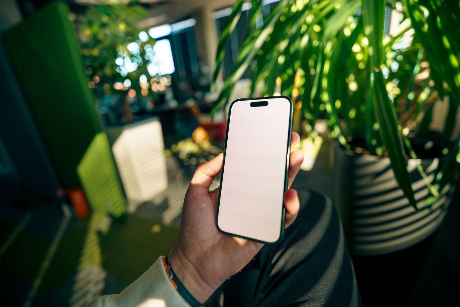
A few habits keep the result credible:
- Use the screen size and aspect ratio of a current, recognisable device, so the interface is not stretched or letterboxed.
- Keep the status bar, notch or dynamic area consistent with the platform; a missing or mismatched status bar looks unfinished.
- Match lighting and reflections to the scene. Glare across the screen can obscure content, so dial it down when legibility matters.
- Choose a background that does not fight the interface. Plain or softly blurred surfaces keep focus on the screen.
Preparing the screen artwork
The frame is only as convincing as the screen placed in it. Sharp output starts with source artwork exported at the right resolution. Modern displays pack more physical pixels into each CSS pixel, and MDN describes the device pixel ratio as the ratio of the resolution in physical pixels to the resolution in CSS pixels for the current display device. A design exported at logical size and then enlarged inside a mockup will look soft, so export at a larger scale and let the mockup reduce it.
For websites, the screen content should reflect a real responsive layout. Pages meant for many devices need the right viewport setup, and web.dev states that pages optimized for a variety of devices must include a meta viewport tag in the head of the document. When mocking up a site on a phone, a screenshot of a page without that setup would show a shrunken desktop layout, which misrepresents what visitors actually get.
Fill the screen with believable content. Placeholder text such as repeated filler lines draws attention to itself, while realistic names, prices and images let reviewers judge hierarchy and tone. Avoid copyrighted or trademarked content that is not yours to display in a public portfolio.
Working in design tools
Most design tools support the same underlying technique: a frame image sits above or around a placeholder, and the screen artwork is placed so it follows the frame’s shape. In Photoshop this is typically done with smart objects, where replacing the contents updates the mockup while keeping the perspective and effects. In Figma and similar tools, a device frame can be a component, and the screen is a nested layer or image fill that can be swapped without disturbing the frame.
Whichever tool is used, a few practical points apply. Keep the screen layer separate from decorative layers so the artwork can be replaced cleanly. Keep clipping masks tight to the display shape, including rounded corners, so content does not bleed into the bezel. Export at a size suited to the destination: large for print or high-density displays, smaller and compressed for web pages where load time matters.
When the same screens go into several devices, standardise the artwork first and reuse it. Consistency across the set makes a flow easier to read and reduces the chance of one outdated screen slipping into a final deck.
Platform rules for store screenshots
Device frames and store listings overlap, but the rules differ. For the Apple App Store, App Store Connect help says an app must include at least one screenshot and can upload up to 10 screenshots per device size. The same page explains that for consistent interfaces only the highest required resolution has to be supplied, because App Store Connect automatically scales them down for smaller device sizes.
The page also states that all screenshots must adhere to the App Store Review Guidelines before they are submitted for review. In practice that means store screenshots should accurately show the app, and decorative frames, marketing captions and device art should be checked against the current guidelines of each store before submission. Rules change, so the vendor’s own pages are the reference point rather than any summary.
A mockup used in a portfolio or sales deck has more freedom than a store asset, but accuracy still matters. Showing screens that the product does not actually have, or features that were never built, can mislead clients and users alike.
Common mistakes to avoid
- Stretched or cropped screens. Always keep the original aspect ratio and check the corners against the frame.
- Low-resolution artwork. Blurry text undermines an otherwise polished scene.
- Outdated devices. An obviously old handset makes a fresh design feel dated.
- Too much scene. Heavy props, shadows and backgrounds pull attention from the interface.
- Inconsistent sets. Mixing device styles and lighting within a single presentation looks careless.
Device mockups also sit alongside other presentation formats. Physical goods need a different approach, and a packaging mockup shows how the same principles of scale, light and context apply to boxes, bags and bottles.
Frequently asked questions
Is a device mockup the same as a prototype?
No. A device mockup is usually a static image of a design inside a device frame, while a prototype responds to input. Some mockups do offer partial functionality, but most only present how a design looks.
What resolution should the screen artwork be?
Export at a larger scale than the logical screen size, because current displays use more physical pixels than CSS pixels. The mockup can then reduce the image without softening text.
Can a device frame be used on a store listing?
It depends on the store. Each platform publishes its own screenshot rules, and the screenshots must follow its review guidelines. Read the current requirements in the store’s own developer documentation before submitting.
Which device should a website mockup use?
Use the devices the audience actually uses. Many sites show a phone and a laptop together to demonstrate how a responsive layout adapts, with the content in each frame matching a real page.